Global Intranet Redesign
At the time, I was a junior communicator who'd taken on design work at a global financial institution when a peer in Singapore flagged a recurring problem: regional teams across 165 locations were struggling to navigate an outdated intranet that hadn't kept pace with the firm's increasingly global workforce. The pressure from senior leaders was to redesign the page quickly - and to add more content to it. I advocated for a different first step: talk to users before changing anything.
Client
Global financial institution (under NDA)
Services
UX Research, Content Strategy, Information Architecture, Visual Design
Industries
Financial Services
Date
May 2024 (5 weeks)

A Communications partner in Singapore messaged me one Monday morning: "I can't find the resources I need for our regional team. Everything on the intranet is buried. " It wasn't the first time I'd heard it. I led the redesign of two intranet pages used by Communications teams across 165 global locations, advocating for user research over the leadership-favored "just add more content" approach. The redesign delivered a 20% improvement in content findability, supported a 20% increase in event participation across 12 activations, and built a scalable template system now in use globally.
The Problem Employees couldn't find clear, timely content about cultural moments and global observances. Critical information was buriedin long, undifferentiated hyperlink lists. Regional partners needed lead time to localize content. And the content that was getting featured wasn't reaching the people it was meant for. Underneath the surface complaint was a deeper issue: the intranet was organized for the people who created the content, not the people who needed to find it.
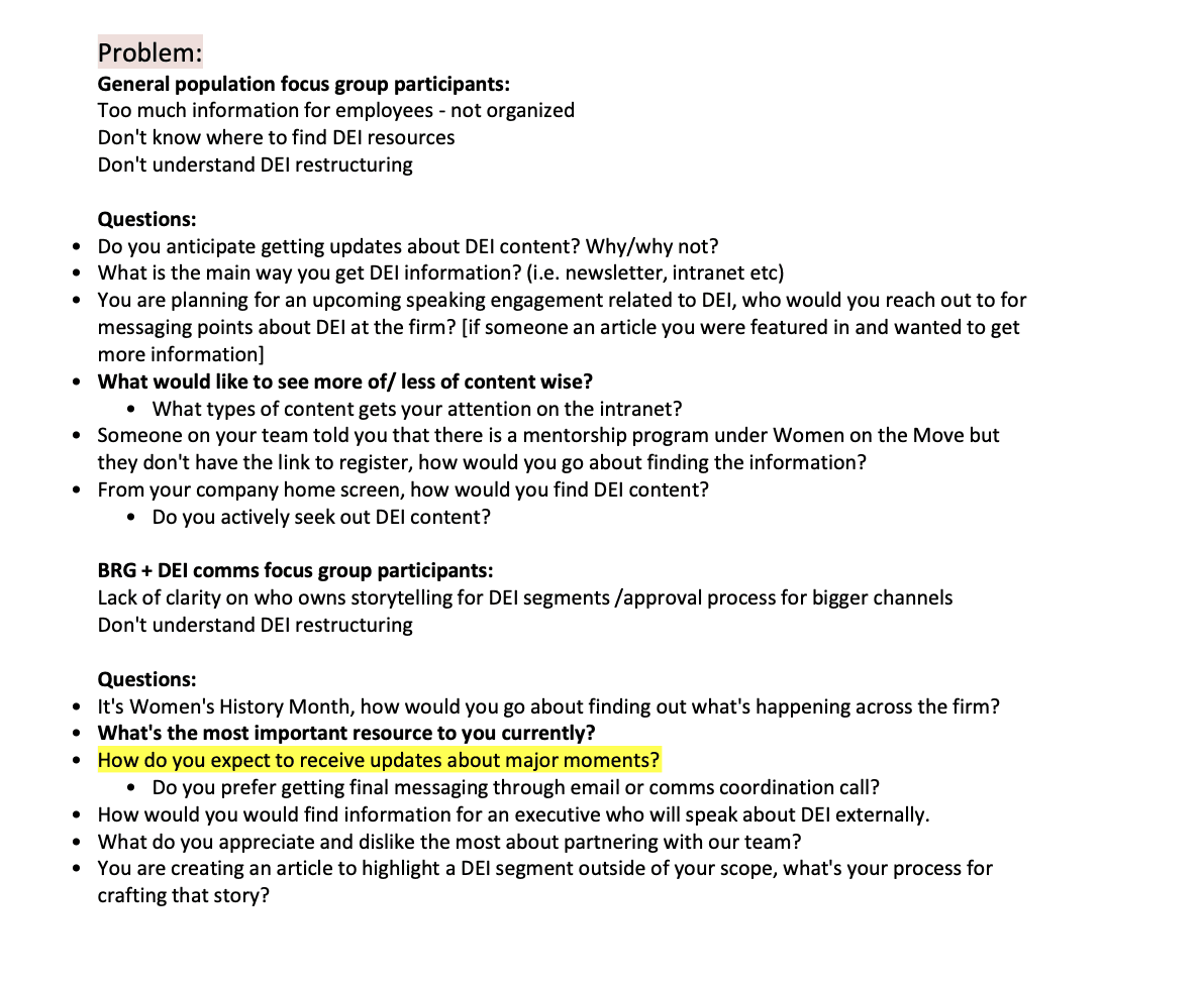
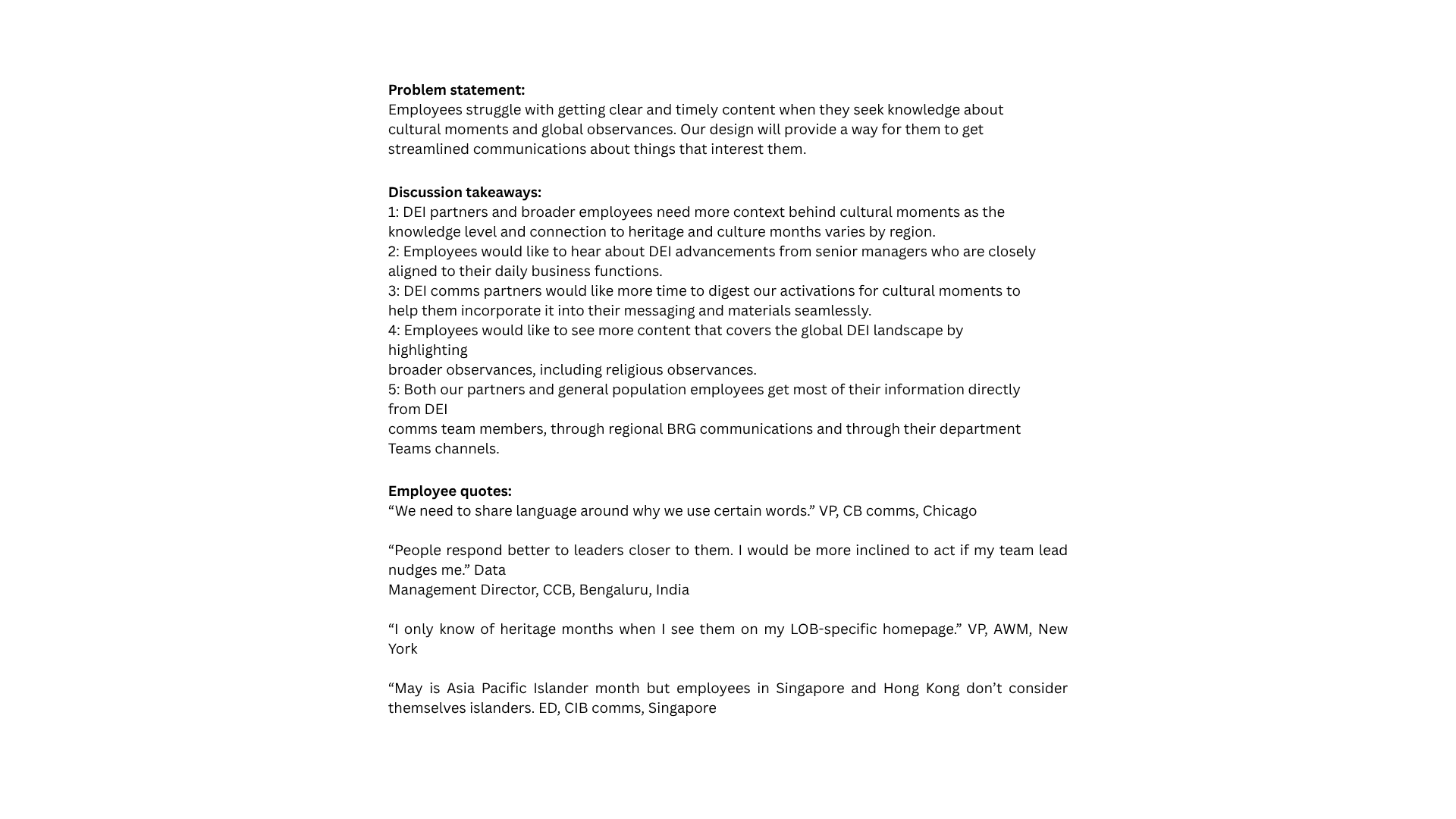
Research & Discovery Rather than redesigning the page on intuition (and on the timeline senior leaders wanted), I pushed for user research first. Focus groups with 15 Communications partners and employees across Chicago, Bengaluru, and Singapore. Findings: - Employees preferred hearing about initiatives from leaders close to their daily work, not just corporate announcements. - Critical content wasn't surfacing where employees actually looked: "I only know about events when I see them on my team's homepage." - Regional partners needed 1–2 weeks of advance notice to incorporate messaging into local materials. - Cultural context varied dramatically by region — what resonated in New York didn't translate to Hong Kong. Content audit of engagement metrics. The takeaway was direct: we had the right content, but it was organized for creators (us), not for users (them). We featured 10 stories on the homepage — overwhelming users with choice — and resources were buried in long hyperlink lists that all looked the same.
The Design Challenge How might we transform a text-heavy link list into a globally relevant, scannable resource hub? How could we help regional teams find what they needed quickly? Constraints I designed within: - 5-week timeline - PowerPoint as my mockup tool (no Figma access) - Had to work within the firm's existing design system - Senior leaders wanted to add more content; I needed to prove that less, better-organized content would perform better


The Solution I redesigned two intranet pages using a card-based system that organized information by type rather than chronology. What changed: - Reduced featured stories from 10 to 6, cutting decision fatigue - Organized resources into clearly labeled card groups instead of generic hyperlink lists - Restructured categories to serve global audiences, not just US-based employees - Built visual hierarchy through card-based containers I went through three iterations — one based on stakeholder edits, two based on user testing. Testing revealed confusing category labels that I refined before final approval. Post-launch, users asked to view more stories at once, so I designed an archive page while keeping the homepage focused.
Outcome: - 20% improvement in content findability (measured year-over-year) - 20% increase in event participation across 12 activations, supported by the new templates - ~12,000 page views for a supported content series over 9 months - Scalable template system now used across 165 global locations
Reflection
Two things stuck with me from this project. First: users don't always need a new product — sometimes they need a better version of what already exists. The most impactful improvements came from organizing existing content better and giving users clear signposts, not from adding more. Second: advocating for users sometimes means pushing back on leadership. When senior leaders wanted to add more content, I came back with data showing reorganization, not addition, was the answer. That was the work — not just the redesign itself.